
- After reading the above headline, you are probably thinking to yourself, “Here we go again, another
article about Millennials and how they are different from other generations.” We are going to
go ahead and confess to you that your expectations are indeed correct – we are going to talk
about how Millennials are different. However, using the ONLY independently validated measure
of brand value, we are also going to give you actual data to prove this is the case.
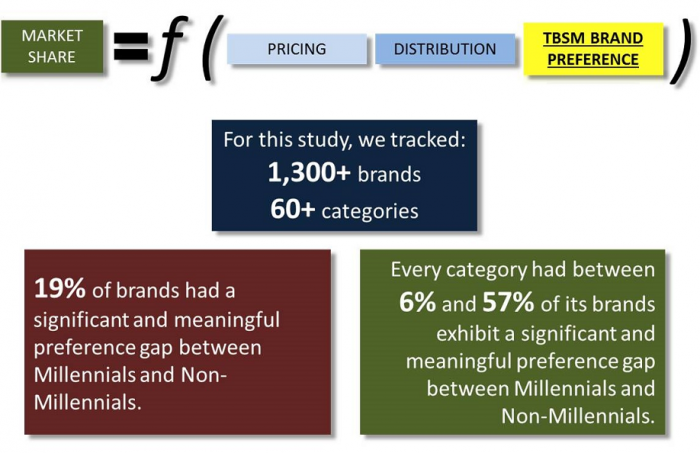
- As a quick background explanation: TBSM (The Brand Strength Monitor) was launched in January 2016 by MSW●ARS Research as a way to continuously track brand preference data for dozens of categories. Though TBSM is relatively new, it is strongly influenced by the legacy MSW●ARS brand choice metric that has proven to be predictive of in-market results for over 40 years. The TBSM brand preference metric fills in the gap between a brand’s pricing/distribution and its market share.

|
|
Table A illustrates the percentage of brands impacted in each category by a significant preference gap between Millennials and Non-Millennials.
As you can see, there is a wide range among the tracked categories. Note: For simplicity sake, we counted all respondents age 35 and under as Millennials.
*at the 95% CL with at least a full three point gap |
- We have included data for the Facial Tissue category in Table B below as an example of what we mean in Table A. As you see with Table A, one-third of the brands (four out of 12) in this category have a significant preference gap between Millennials and Non-Millennials. However, that is only part of the story.
|
|
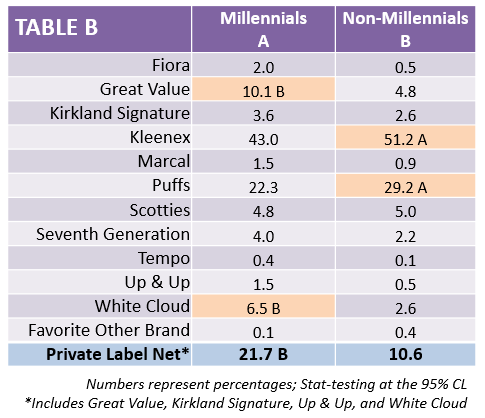
- This type of generational dynamic is not exclusive to Facial Tissue by any means – as Table A demonstrates. It is just one example of what we are seeing happen in categories across the board. Every category we track is impacted at least somewhat by significant differences in brand preferences among Millennials and Non-Millennials.
- Generational shifts like the one we are seeing with Facial Tissue can have large implications on future market share for impacted brands. Given the following relationship between this data and market share we know to be true, either pricing is going to have to be adjusted to compensate, or something (perhaps advertising to improve preference among younger consumers) is going to have to disrupt current preference trends from eroding share of brands that are Non-Millennial heavy:

- Though it is extremely vital, brand preference is not the only measure for which we are seeing large differences between these two age groups. TBSM also captures detailed data for category penetration, which separates consumers into category purchasers, users, future intenders, non-involved, etc.
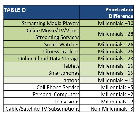
- When we take a look at category penetration differences in Table C, the presence of Millennial/Non-Millennial generational gaps becomes even clearer:
|
|
Millennials are more involved than Non-Millennials in categories at the top (highlighted in light red). Millennials are less involved than Non-Millennials in the categories at the bottom (highlighted in light blue). Categories in the middle (white) do not have significant differences* in category penetration between Millennials and Non-Millennials. These categories are sorted by the significance of the gap between the age groups.
*at the 95% CL with at least a full five point gap |
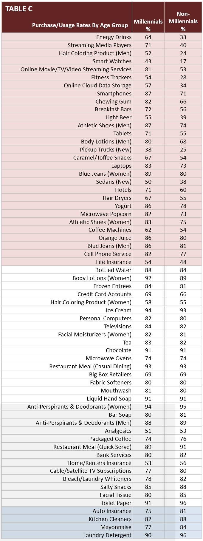
- Categories such as Energy Drinks, Cloud Data Storage, Streaming Media Players, and Tablets are on the lower end of Table A, but very high on Table C – for example.
- This means that while their specific brands do not have among the largest degrees of preference differences between the age groups, the composition of their users skews heavily toward Millennials. So, while Millennials enter these categories at much higher levels than Non-Millennials, their brand preferences are relatively more aligned with Non-Millennials versus the other categories we track.
|
|
- Without the benefit of time travel, we have no quick way of seeing if this younger generation will eventually switch to what the older generations prefer in categories where we are currently seeing significant differences. What we can do is continue to track these categories (and more) while engaging in research that determines why this is happening. That way, while we can not travel to the future in a time machine, we can be sure to do our best to shape it in the present. TBSM is a great way of uncovering these issues with your category and tracking them over time, due to its proven methodology, large sample each month, and cost effectiveness.
- Thank you for reading this mini-blog, which features just one of many different demographic reads we can get from the TBSM platform. All of the data we have referenced in this post is readily available – if you are interested in seeing it for yourself. Also, while this blog only references April-June data, we also have data for the other 2016 months for many of these categories.
- Each month, we collect 1,000 respondents for each category, which standardly include roughly the following demographic breakouts for brand choice and category penetration:
- Females: 500
- Males: 500
- African-Americans: ~130
- Hispanics: ~100
- Millennials (Age 35 and Under): ~400
- Non-Millennials (Age 36 and Over): ~600
In addition, the following demographics are also standardly available in many different splits:
- Yes/No Children in Household
- If Yes, Age of Children in Household
- Education Level
- Some High School, High School Diploma, Bachelor’s Degree, Master’s Degree, etc.
- Income Level
- Split 15 ways from $7,500 or less to $200,000 or more
- Marital Status
- Single, Married, Domestic Partnership, Divorced, etc.
- States (as we used in our map above)
- All 50 states + DC, as well as custom regions – if desired
As you saw in this blog entry, MSW●ARS is already tracking this data for the following categories. Let us know if you see
one you are interested in, or if you would like us to begin tracking your category:
- Antiperspirants/Deodorants (Women)
- Antiperspirants/Deodorants (Men)
- Analgesics, Internal
- Athletic Shoes (Women)
- Athletic Shoes (Men)
- Auto Insurance
- Bank Services
- Bar Soap
- Bathroom Tissue
- Bleach or Laundry Whiteners
- Blue Jeans (Women)
- Blue Jeans (Men)
- Body Lotions (Women)
- Body Lotions (Men)
- Bottled Water
- Breakfast Bars
- Cable or Satellite TV Subscriptions
- Caramel/Toffee Snacks
- Casual Dining Restaurants
- Cell Phone Carriers
- Chewing Gum
- Chocolate Candy
- Cloud Data Storage
- Coffee Machines
- Credit Cards
- Energy Drinks
- Fabric Softeners
- Facial Moisturizers for Women
- Facial Tissue
- Fitness Trackers
- Frozen Entrees
- Hair Coloring (Women)
- Hair Coloring (Men)
- Hair Dryers
- Home/Renters Insurance
- Hotels
- Ice Cream
- Kitchen Cleaners
- Laptop Computers
- Laundry Detergent
- Life Insurance
- Light Beer
- Liquid Hand Soap
- Mayonnaise
- Microwave Ovens
- Microwave Popcorn
- Mouthwash
- Online Movies/TV/Video Streaming Services
- Orange Juice
- Packaged Coffee
- Personal Computers
- Products from a Big Box Retailer
- Quick Serve Restaurants
- Salty Snacks
- Sedans
- Smart Watches
- Smartphones
- Streaming Media Players
- Tablet Computers
- Tea
- Televisions
- Trucks
- Yogurt
If you see some data you would like to see expanded upon, please send us a note at sales@thebrandstrengthmonitor.com.