
It is difficult to watch or read the news without hearing about political divisions in the US. Whether
they’re talking Democrats, Republicans, Libertarians, or the Green Party, there seems to be a lot
of disagreement out there. However, we here at MSW●ARS Research have discovered factions you
may not have even known existed until now – with consumer categories. As a fun repurposing of the
data we collect using our Brand Strength Monitor platform, we are getting to the bottom of
this – one category at a time.
Throughout the 2016 US Presidential Election season we’re sharing some “voting” results. Instead of the
traditional red state/blue state/swing state format, we’re looking at “voting” results for some of
the more than 60 categories on The Brand Strength Monitor Dashboard to determine which brand would
win an election versus its category competitors.
Instead of simply looking at the “popular vote” across thousands of respondents, we decided it would
be a lot of fun to look at results by state Electoral College votes – similar to how the US actually
elects its president every four years.
Thus far, we have included maps for the following categories:
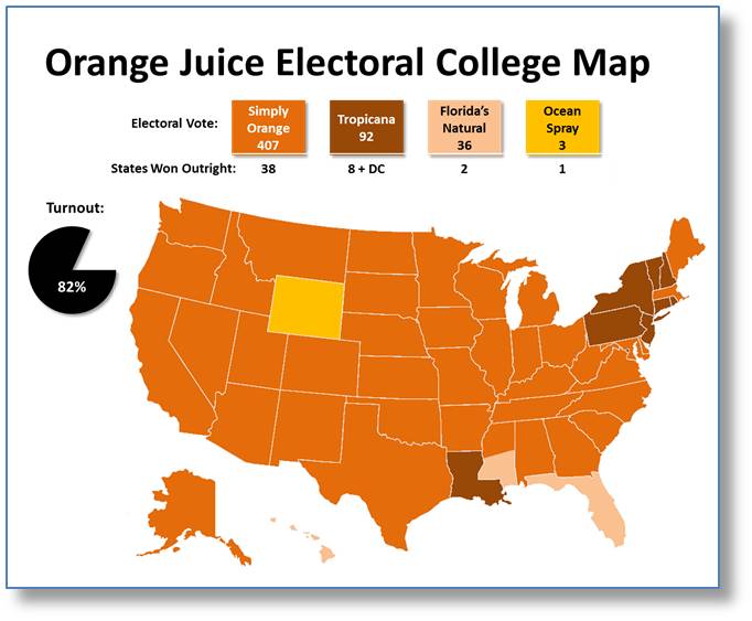
This week, the category is Orange Juice.
- Simply Orange far exceeds the number of electoral votes needed to win the presidency with 407 (270 needed) and outright wins in 38 different states.
- This includes every state in the Midwest as well as every state west of the Mississippi River aside from Louisiana, Hawaii, and Wyoming.
- Simply Orange also does well in the Southeast and Mid-Atlantic areas by only losing (barely) Florida and the District of Columbia.
- All in all, Simply Orange has well-rounded appeal and it’s a lot easier to find its strengths than its weaknesses on this map.
- As seen with Poland Spring Bottled Water and Scott Toilet Paper on previous maps, the Northeast prefers a different brand in the Orange Juice category too: Tropicana.
- Tropicana comes on top in the large states of New York, Pennsylvania, and New Jersey (greatest margin of victory), which help it nearly achieve 100 electoral votes.
- Of course, this brand is not a regional one even if this map at first glance would suggest otherwise. Tropicana is consistently second to Simply Orange in most states where it does not win.
- This includes a very close call in Illinois, which would have made a 40 electoral vote swing in the margin between the two brands (+20 for Tropicana and -20 for Simply Orange).
- It also should not be overlooked that Tropicana pulls off the victory in Louisiana, which is very far away from its Northeast sweet
spot.
- The winner in Florida, naturally, is Florida’s Natural (sorry we couldn’t resist).
- In addition, the brand is also able to come on top in Hawaii and split the vote in Mississippi via a too-close-to-call tie.
- On one hand, Alabama almost wound up in the win column for Florida’s Natural. On the other hand, Simply Orange narrowly missed taking Florida from Florida’s Natural. In all, it’s pretty safe to say Florida’s Natural is a popular brand in this category – especially in Florida and the states bordering it.
- Lastly, Ocean Spray pulls out the victory in Wyoming to give it fourth place in the electoral count. Instead of saying that low base sizes in a state with a small population may have contributed here, we’ll just say that Ocean Spray’s supporters turned out in large numbers to put them over the top!
- As previously mentioned, this data is a by-product of what we standardly collect in our TBSM (The
Brand Strength Monitor) platform. It is the ONLY independently validated measure of brand
value – available for a fraction of the cost of almost all brand health studies these
days.
- Each month, we collect 1,000 respondents for each category, which standardly include roughly the following demographic breakouts for brand choice and category penetration:
- Females: 500
- Males: 500
- African-Americans: ~130
- Hispanics: ~100
- Millennials (Age 35 and Under): ~400
- Non-Millennials (Age 36 and Over): ~600
In addition, the following demographics are also standardly available in many different splits:
- Yes/No Children in Household
- If Yes, Age of Children in Household
- Education Level
- Some High School, High School Diploma, Bachelor’s Degree, Master’s Degree, etc.
- Income Level
- Split 15 ways from $7,500 or less to $200,000 or more
- Marital Status
- Single, Married, Domestic Partnership, Divorced, etc.
- States (as we used in our map above)
- All 50 states + DC, as well as custom regions – if desired
The brands included in this Orange Juice exercise are:
- Dole
- Florida’s Natural
- Great Value
- HomeMaker
- Lakewood Organic
- Langers
- Minute Maid
- Naked
- Natalie’s
- Noble Organic
- Ocean Spray
- Odwalla
- Prairie Farms
- Simply Orange
- Tropicana
- Welch’s
- Your Favorite Other Brand
MSW●ARS is already tracking this data for the following categories. Let us know if you see
one you are interested in, or if you would like us to begin tracking your category:
- Antiperspirants/Deodorants (Women)
- Antiperspirants/Deodorants (Men)
- Analgesics, Internal
- Athletic Shoes (Women)
- Athletic Shoes (Men)
- Auto Insurance
- Bank Services
- Bar Soap
- Bathroom Tissue
- Bleach or Laundry Whiteners
- Blue Jeans (Women)
- Blue Jeans (Men)
- Body Lotions (Women)
- Body Lotions (Men)
- Bottled Water
- Breakfast Bars
- Cable or Satellite TV Subscriptions
- Caramel/Toffee Snacks
- Casual Dining Restaurants
- Cell Phone Carriers
- Chewing Gum
- Chocolate Candy
- Cloud Data Storage
- Coffee Machines
- Credit Cards
- Energy Drinks
- Fabric Softeners
- Facial Moisturizers for Women
- Facial Tissue
- Fitness Trackers
- Frozen Entrees
- Hair Coloring (Women)
- Hair Coloring (Men)
- Hair Dryers
- Home/Renters Insurance
- Hotels
- Ice Cream
- Kitchen Cleaners
- Laptop Computers
- Laundry Detergent
- Life Insurance
- Light Beer
- Liquid Hand Soap
- Mayonnaise
- Microwave Ovens
- Microwave Popcorn
- Mouthwash
- Online Movies/TV/Video Streaming Services
- Orange Juice
- Packaged Coffee
- Personal Computers
- Products from a Big Box Retailer
- Quick Serve Restaurants
- Salty Snacks
- Sedans
- Smart Watches
- Smartphones
- Streaming Media Players
- Tablet Computers
- Tea
- Televisions
- Trucks
- Yogurt
If you see some data you would like to see expanded upon, please send us a note at sales@thebrandstrengthmonitor.com.
Thank you for reading and we will continue to release maps for new categories as the 2016
US Presidential Election approaches.