
Brand managers can change pricing and distribution, but that does not always translate into a change in market share. That is because there is a variable in the equation that can make or break forecasts put in place using pricing and distribution figures. That variable is brand preference.
We here at MSW-ARS have a brand preference measure that is unlike any other because it is the only independently validated measure of brand value.
Though we have been collecting this brand preference measure for decades, a recent breakthrough occurred in January 2016 when we launched The Brand Strength Monitor (TBSM), which made the measure widely available in a syndicated system. It allows brands to receive a monthly update on their brand health that can easily be split by key demographics for a very reasonable price due to the syndication.
This blog post, which is the first in a series of posts sharing insights from this data, will focus on the biggest winners and losers from Q1 2016 to Q1 2017, including causes as well as implications for their respective categories.
Before we share this week’s category, first we would like to show you a 10,000 foot view of how Q1 2017 compares to Q1 2016 for the 750+ brands we tracked during this time. You’ll notice that there is a very strong correlation, and that is because our brand preference metric (like actual market share itself) is not easy to move. It does not overreact. Therefore, it is especially noteworthy when any individual brand is actually able to experience a significant change…
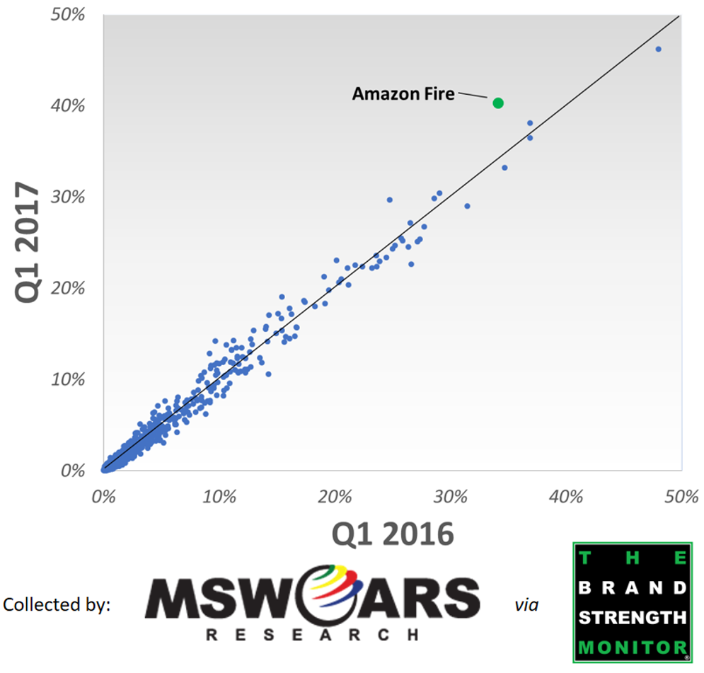
…and as you can tell from the above scatter plot, Amazon Fire, in the Streaming Media Player category, is the biggest winner with the highest growth from Q1 2016 to Q1 2017.
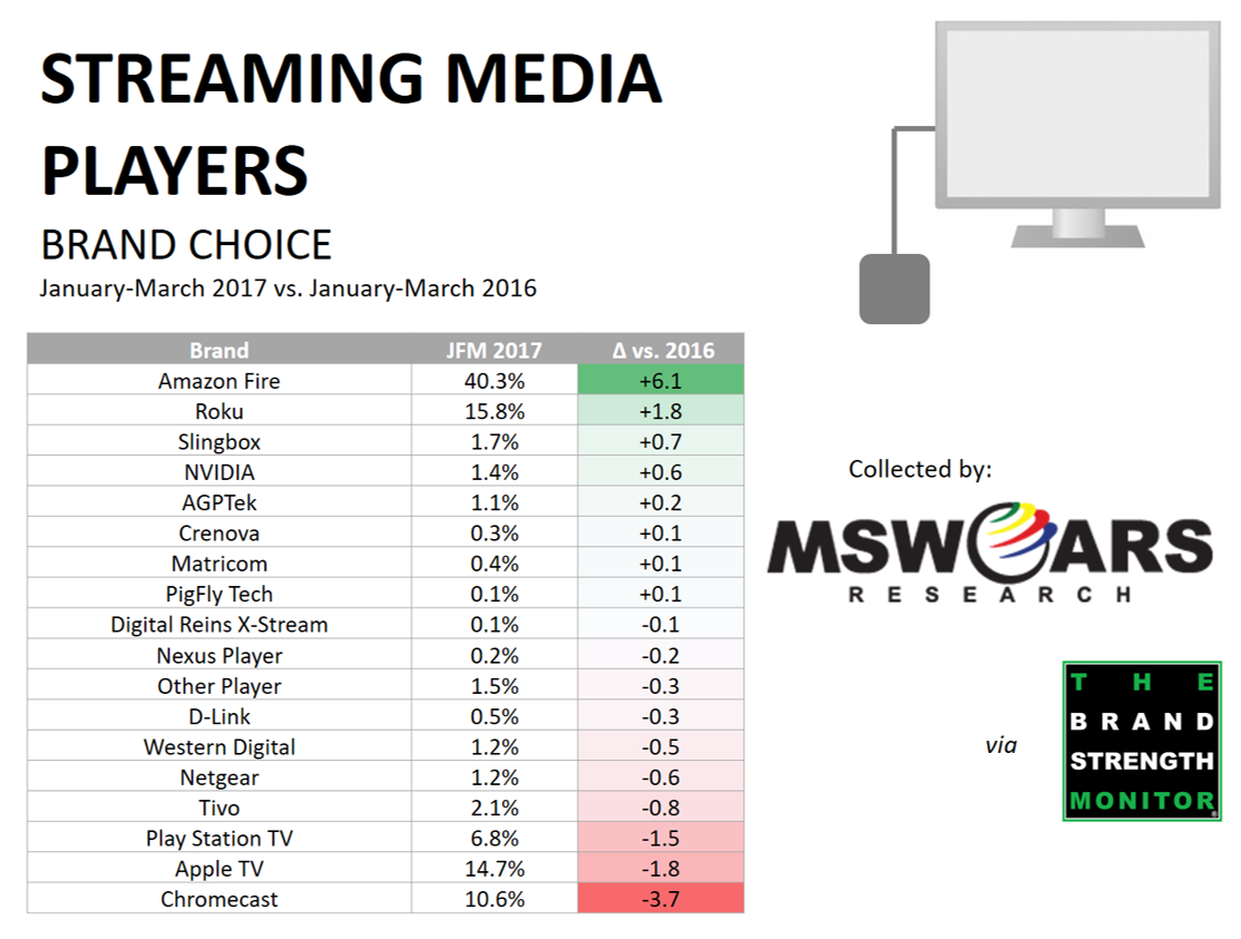
What is incredible about Amazon Fire’s preference growth is that they were already the #1 preferred Streaming Media Player platform in Q1 2016 – being picked by around one-third of those we surveyed. In Q1 2017, they are able to eclipse the 40% threshold even though they had by far the least amount to gain of any brand in the category. Even the #2 brand, Roku, saw growth only a fraction that of Amazon Fire.
If you are not familiar with the various options in this category, then you may be wondering why this is occurring. Opinions vary, though there is a great article on geek.com from the middle of Q1 2017 that outlines the reasons why one may prefer the Amazon Fire Stick over other popular offerings.
Also, while the brand preference metric utilized in TBSM by itself is reliable and predictive of market share, the platform available with TBSM is also helpful with its easy access to key demographic splits.
For example, with Amazon Fire, we are able to easily pull the following segments (as well as others) to see which demographics are driving the strong Q1 2017 results.
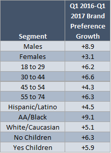
Not surprising, when you are growing more than just about any other brand out there, the growth is oftentimes widespread across different groups of people. This is true with Amazon Fire Stick’s growth as just about every demographic split you can possibly piece together shows at least some growth. However, what is especially impressive is their growth with Males as well as AA consumers, not to mention that it is spread out evenly among the different age groups.
Congratulations to Amazon Fire and their growth over the past year! Over the coming weeks we will continue to share interesting nuggets from the Q1 2016 – Q1 2017 data we have collected.
If you would like more information regarding this or other data, then feel free to send us a line at sales@thebrandstrengthmonitor.com.
Thank you for reading and we look forward to sharing more learnings in the future.